Presenting data
Figures and tables can be used to present data in your report or thesis. It is a means of presenting information in a concise manner. This page covers important questions to ask yourself when using visual presentation methods to present data.
Figures can include diagrams such as drawings, logos, or cartoons, but most often they are graphs or charts. Tables usually display numerical data arranged in rows and columns.
Using tables and figures
A key consideration is whether a table or figure is needed in the first place. In some cases, it is easier and simpler to provide explanatory text. For example, the following table is best described as follows:
In 2011, seven members of the management team received salaries of between $150,000 and $180,000 while the Executive Director’s salary was around $230,000.
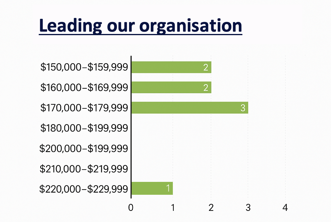
(Oxfam, 2012)
Tables are used to show precise data; figures—such as graphs—are used to show trends.
The graph below shows how several inequality measures have changed over time. A table of the same data would not show the differences between them quite as clearly.
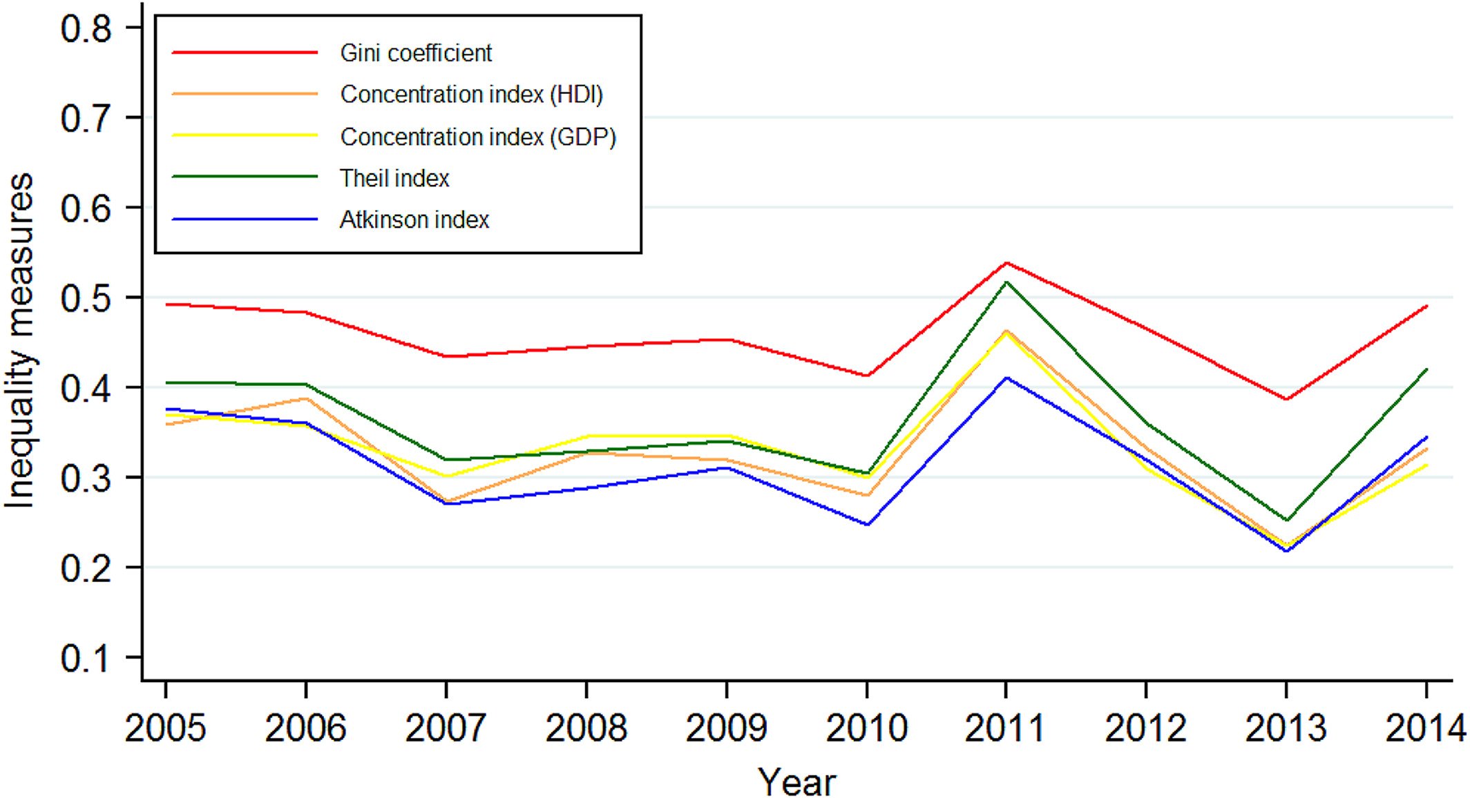
(Yan et al., 2019, p. 457)
A table might be presented as follows:
Table 2 shows that the proportion of people with catastrophic healthcare expenditure decreases with income decile, with those in the lowest income decile having the highest percentage of people with catastrophic healthcare expenditure. The concentration index for the distribution of catastrophic expenditure was − 0.39 (95% CI: -0.43, − 0.34) in 2006, and increased to − 0.46 (95% CI: -0.50, − 0.42), showing an increase in the distribution of catastrophic healthcare expenditure towards those of lower income over time.
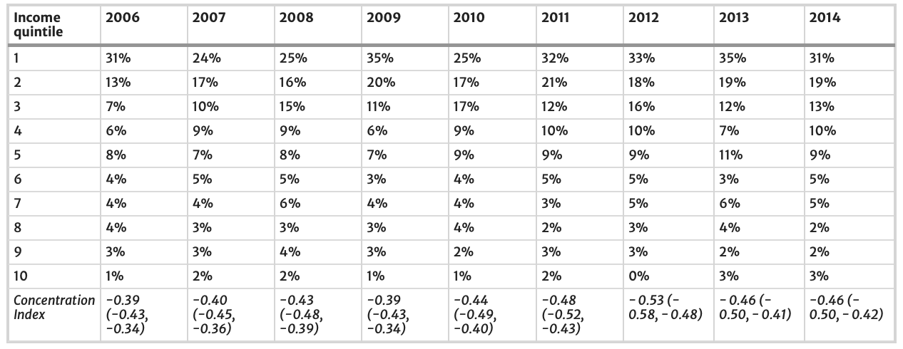
(Callander et al., 2019, pp. 4-5)
The information below, however, is best presented as a graph as it shows a changing relationship or trend over time:
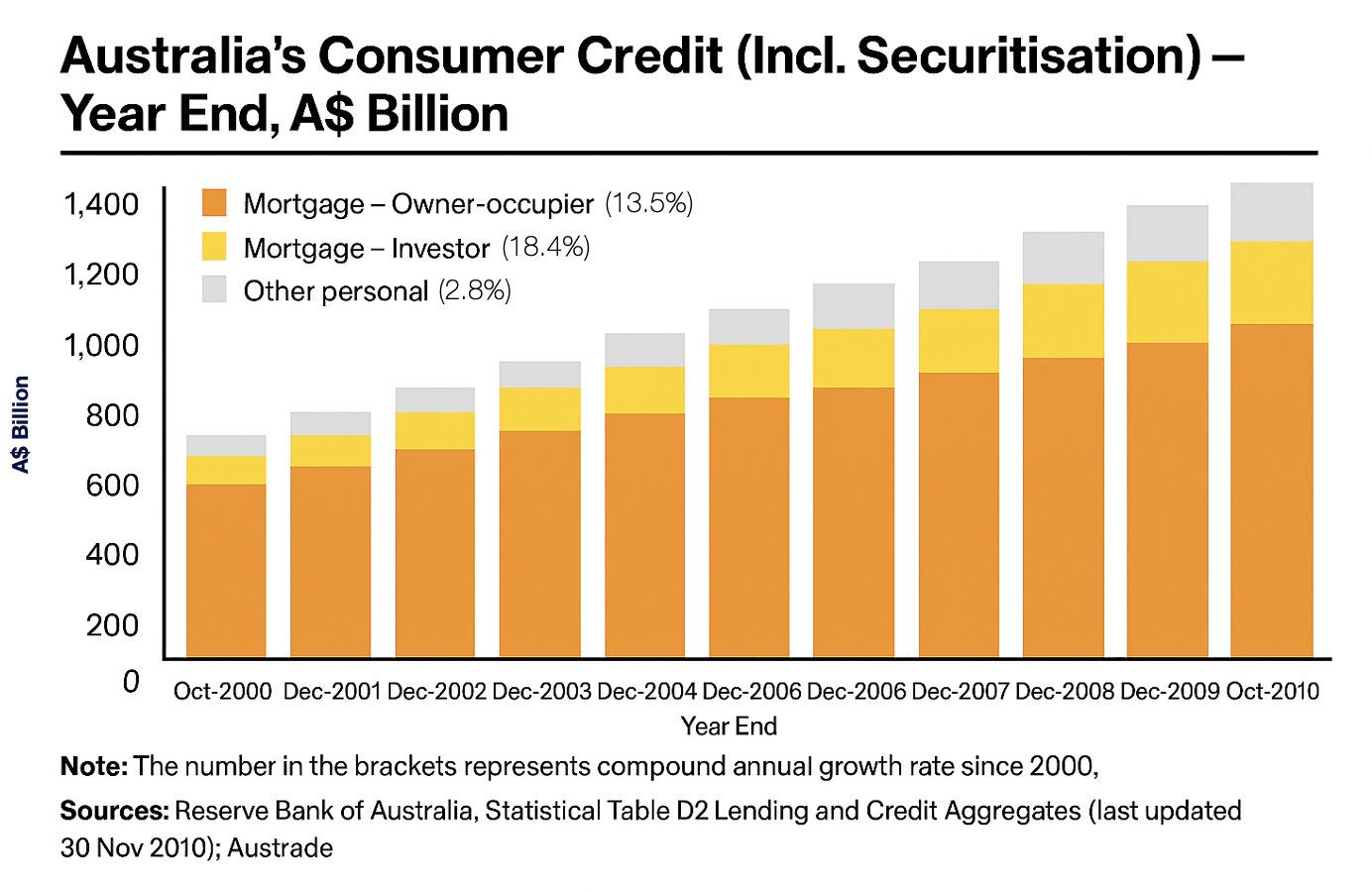
(Australian Trade Commission, 2011)
Tables and figures should never be inserted into the text without a ‘lead-in’ phrase, or an indicator referring directly to the table or figure. It is a good idea to vary these ways of presenting the lead-in phrase or ‘hook’ as it ensures your writing is not monotonous. The passage below can be written in multiple ways (with minor differences in wording).
Consider the examples:
- Example 1: Interestingly, there were no statistically significant differences across type of enterprise. Nevertheless, when responses were compared by ‘remoteness’ (Table 3), it was possible to identify differences across means that were statistically significant at the 5% level.
- Example 2: Table 3 below shows that there were no statistically significant differences across type of enterprise. Nevertheless, when responses were compared by ‘remoteness’, it was possible to identify differences across means that were statistically significant at the 5% level.
- Example 3: Interestingly, there were no statistically significant differences across type of enterprise. Nevertheless, when responses were compared by ‘remoteness’, it was possible to identify differences across means that were statistically significant at the 5% level (see Table 3 below).
‘Above’ and ‘below’ (and ‘See …’) are helpful directional expressions for the reader. They are important in large, complex dissertations with many figures and tables. Readers need to know where to look. Note that ‘see Table 3 below’ is shortened in the embedded version as it would be too wordy and result in a less fluent and readable passage of text.
It may not be possible, in dissertations that have a lot of tables and figures, to locate the data next to where it is discussed in the text so it might be necessary to consider different strategies for figure/table placement.
Tables and figures are numbered independently and consecutively sequenced in the text in which you refer to them, starting with ‘Table 1. ‘ and ‘Figure 1.’
In some cases, you might need secondary sequencing such as ‘Table 1a’, ‘Table 1b’, or ‘Table 1.1’, ‘Table 1.2’, etc., but avoid more than three levels of numbering as it can be hard to read.
Renumbering is critical when text sequencing changes. Microsoft Word has a figures and tables caption function that allows this to be done easily. This also allows the table of figures to be placed after the table of contents for the thesis. It is worth learning how to use this function well before thesis preparation.
In general, place tables and figures close to the text where you first refer to them. Sometimes, if there are many tables and figures, it may be necessary to place tables/figures at the end of the manuscript and include a text indicator in the appropriate place, e.g., ‘Table 3.2 here’. Journals often request this of authors when they are submitting papers for publication. For example:
Tables and Figures. Tables and figures (illustrations) should not be embedded in the text but should be included as separate files. A short descriptive title should appear above each table with a clear legend and any footnotes suitably identified below. All units must be included. Figures should be labelled, considering necessary size reduction. Captions should be typed, double-spaced, on the final page of the main document.
(Taylor and Francis, 2012)
Managing tables and figures in a thesis
- Avoid overloading the main text with large datasets.
- Use appendices to store extensive tables or figures at the end of your thesis.
- Condense information from large datasets into smaller summary tables/figures in the main text.
- Refer to the original dataset in the appendix (e.g., “See Appendix 1”).
- Label appendices clearly: Appendix 1, Appendix 2, etc.
- Provide a balance: summary in the text, details in the appendix.
Key elements of a table
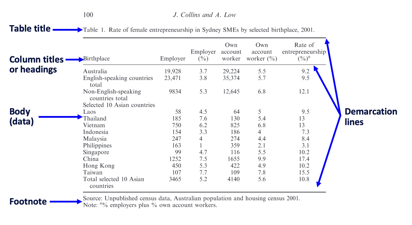
(Collins and Low, 2020)
If there are several explanatory details to be added in the Footnote/Notes section, number the individual notes; if there are only two to three, sometimes an asterisk (*), a dagger (†), and double dagger (‡) are provided—in that order—to distinguish the notes.
Sometimes the notes can be extensive as they are below:
However, where possible, keep the notes succinct and place most explanatory information in the text describing the table.
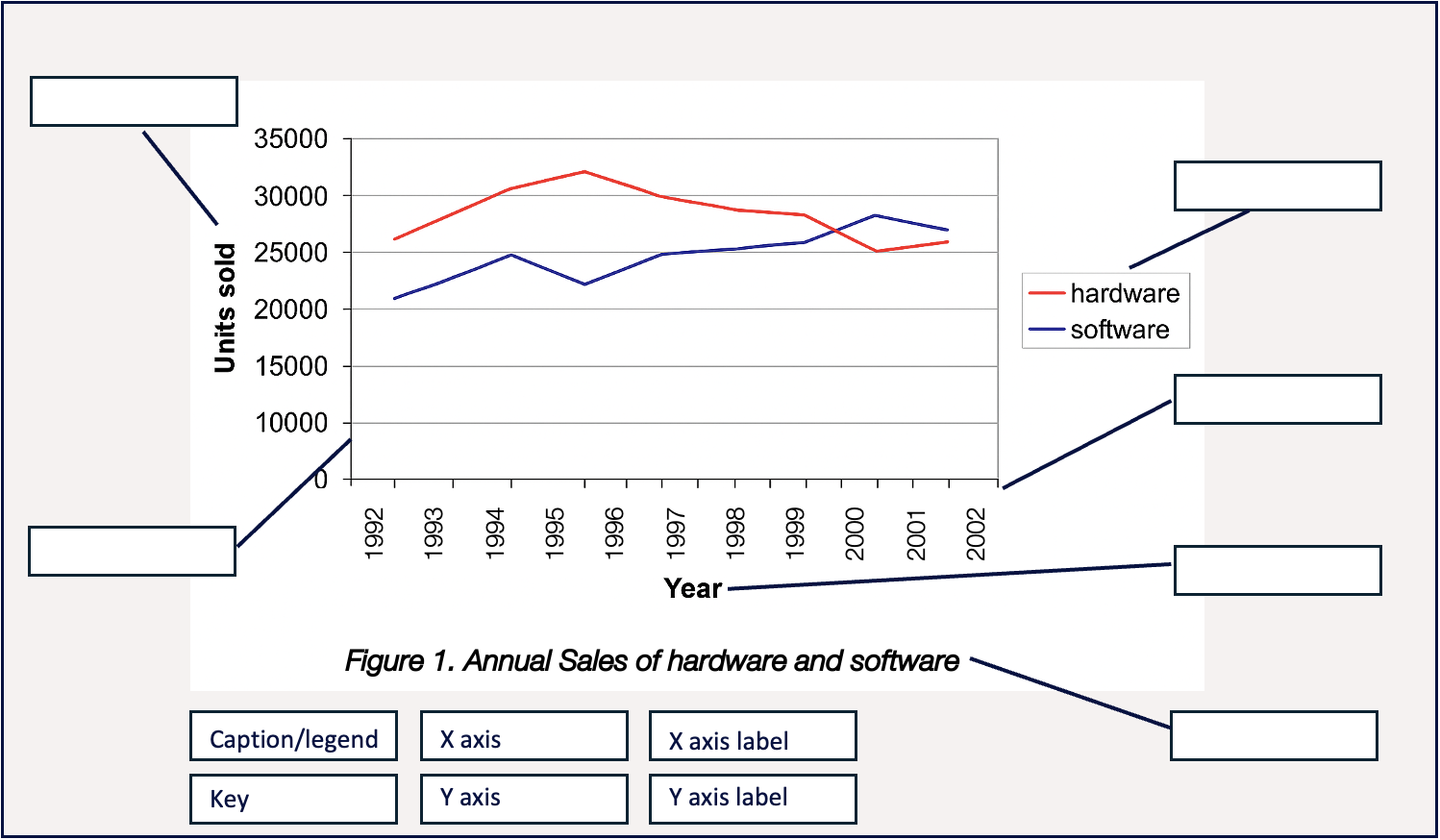
Key elements of a figure
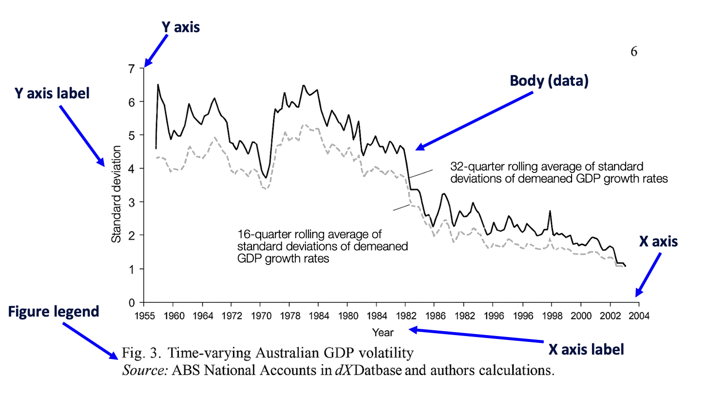
The legend might simply show the source and description, or it might also contain notes. Sometimes a key is also needed - use whatever style is needed to make the information clear. This is the way to discriminate between categories of data. In the example below, the key shows average business-led multipliers by postcode.
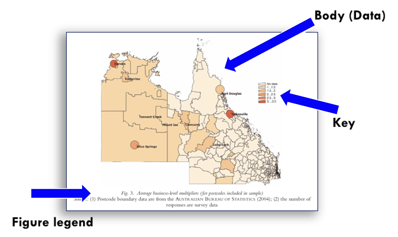
Activity
Can you identify the parts of the figure below?
(The terminology is given below the figure.)
When proofreading tables and figures, consider each of the following:
- Format: Have you chosen the format that best meets your needs and those of the reader?
- Placement: Are the tables and figures located close to where they are mentioned in the text? In the case of summary tables/figures, is there a clear reference to an appendix where the more extensive table/figure is provided?
- Labelling: Is the labelling consistent and sequenced correctly?
- Accuracy: Is the data clear and legible?
- Recency of data: Is the data provided in tables and figures from sources published in the last 5-7 years?
- Does the text support the table or figure? Does the descriptive text referring to the table or figure accurately and correctly describe the data provided in it?
- Repetition: Ensure each table/figure only appears once.
- Numbering: As noted earlier, ensure that tables and figures are numbered separately, i.e., Table 1, Table 2, Table 3, etc. Figure 1, Figure 2, Figure 3, etc. Do not use excessive numbering, and never exceed three levels, e.g., 4.1.1.
- Sequencing: Check the number sequencing. Use the ‘Insert Caption’ function in the ‘References’ tab in Word to ensure that this is accurate at all times, even when the thesis is re-ordered.
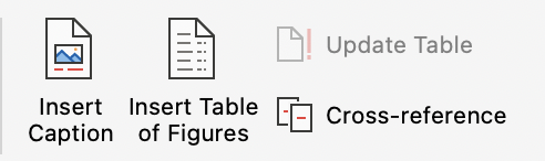
- List of tables and figures: If you have used the ‘Insert Caption’ for all tables and figures throughout the thesis, a list of tables and figures can be created using the ‘Insert Table of Figures’ function (see the above image). This list is placed below the table of contents.
- Citation of sources: Cite all tables and figures as appropriate to the referencing style used. If you are using APA7 for your thesis, for example, there are conventions for font style and placement of titles. In APA7, the table number must appear in bold font and above the table title, while the table title appears below it in italics. Speak with a librarian or find a time with the Graduate Research School to ensure your citation convention aligns with the referencing style you incorporate in your thesis.
As per normal scholarly practice, information or ideas obtained from other sources need to be cited. This includes the use of tables and figures. If the table or figure is taken directly from a source without alteration, then normal citation practice applies - provide the author’s name and year of publication, or if there is no author, the organisation name and year.
If, however, you alter the table or figure to suit your own purposes, it is common to see the phrase: ‘Adapted from [surname, year]’ or ‘Based on [surname, year]’, e.g., ‘Adapted from Smith (2021)’. This information can be also cited in parentheses in information prominent citation style, e.g., ‘….. (Adapted from Smith, 2021)’. This makes it clear that you have taken some information from the cited source and used it for a different purpose. This is acceptable as long you provide a citation.
Sometimes several sources need to be cited. You can do this by creating a composite table or figure from information taken from different publications. In this case, apply normal practice for citing multiple sources, e.g., ‘(Adapted from Smith, 2021; Turner, 2018; Xu, 2010)’.
When making a summary table/figure of your own from a large dataset provided in an Appendix, a citation might not be needed if the figure or table is your own work. However, you might still need to write ‘Adapted from …’ depending on how close your summary table/figure is to the original source(s) - the original table/figure in the Appendix might need to be cited. Attention needs to be given to correct attribution.
There are differences in the way in which tables, graphs, and diagrams etc., are presented and this depends on the referencing style required your thesis. See FedCite.
More resources
More information
Australian Trade Commission (2011). Australia’s banking industry. http://www.austrade.gov.au/…/2792/Australias-Banking-Industry.pdf.aspx
Callander, E. J., Fox, H., & Lindsay, D. (2019). Out-of-pocket healthcare expenditure in Australia: Trends, inequalities and the impact on household living standards in a high-income country with a universal health care system. Health Economics Review, 9(1), 1-8. https://doi.org/10.1186/s13561-019-0227-9
Collins, J. & Low, A. (2010). Asian female immigrant entrepreneurs in small and medium-sized businesses in Australia. Entrepreneurship & Regional Development, 22(1), 97-111.
Oxfam (2012). Our directors. http://www.oxfam.org.au/about-us/our-people/our-directors.
Taylor and Francis (2012). The Journal of International Research – Instructions for Authors. http://www.tandf.co.uk/journals/authors/vjerauth.asp
Yan, W., Wang, W., van Wijngaarden, P., Mueller, A., & He, M. (2019). Longitudinal changes in global cataract surgery rate inequality and associations with socioeconomic indices. Clinical & Experimental Ophthalmology, 47(4), 453-460. https://doi.org/10.1111/ceo.13430